
Site Health Dashboard
The dashboard displays details of wired and wireless devices deployed on the site. This page includes information on client connectivity statistics, change logs, health of devices, and RF health of the site.
To launch the dashboard, complete the following procedure:
- In the app, set the filter to a site.
- Under , click to launch the dashboard.
Alternatively, the dashboard can be accessed by selecting a site from the dashboard page.
Health Bar
The Health Bar provides a snapshot of the overall health of the devices configured at the site. If there are any potential issues, it is indicated by the ![]() status icon and corresponding descriptions are displayed. When there are multiple criteria issues, only the issue criteria with the highest priority is displayed. The <+x> next to the description indicates that there are more issues. You can hover over the value to view the description of the issue in a pop-up window. For more information, see Health Bar Dashboard for Site.
status icon and corresponding descriptions are displayed. When there are multiple criteria issues, only the issue criteria with the highest priority is displayed. The <+x> next to the description indicates that there are more issues. You can hover over the value to view the description of the issue in a pop-up window. For more information, see Health Bar Dashboard for Site.
The descriptions displayed for the Potential Issue are corresponding to the issue encountered at the site. The following is a list of possible messages:
- Offline controller
- Offline switch
- Offline access point
- Access point high noise floor (2.4 GHz)
- Access point high noise floor (5 GHz)
- Controller high CPU usage
- Access point high CPU usage
- Switch high CPU usage
- Controller high memory usage
- Access Point high memory usage
- Switch high memory usage
- Access point high channel utilization (2.4 GHz)
- Access point high channel utilization (5 GHz)
- Silverpeak state <major or critical alarm>
- Cape network state <issue>
- Uplink down
- Tunnel down
To launch the Health Bar, complete the following steps:
- In the app, set the filter to a site.
- Under , click .
-
Click the status icon next to the site name, the Health Bar pop-up appears.
- Click the
 pin icon to pin the Health Bar to the Site Health page.
For information about what the status icons and the indicators denote, see Health Bar Icons.
Figure 1 Site Health Bar
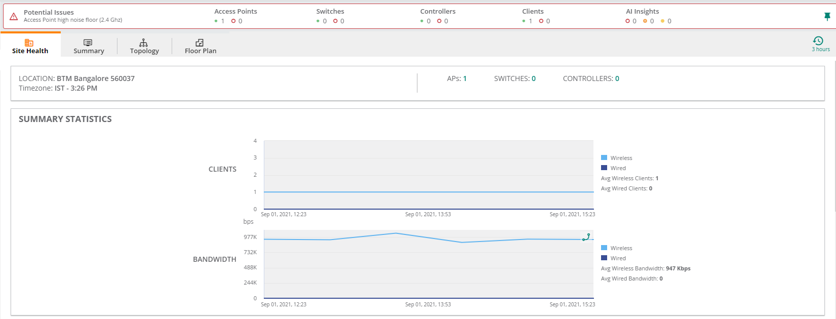
The dashboard displays the information listed in the table below:
|
Content |
|
|
|
Name of the site. |
|
|
Location of the site. |
|
|
Timezone name and local time. For example, IST-11:25 AM. |
|
|
Number of APs deployed on the site. |
|
|
Number of switches deployed on the site. |
|
|
Number of controllers deployed on the site. |
|
|
A graphical representation of the number of clients (wired and wireless) and their bandwidth usage for the selected time range. |
|
|
A visual representation of change logs for configuration, firmware, and reboot changes in the selected time range. Select a column in the graph and click on the , and button to view detailed information logs on the corresponding events in the site. |
|
|
|
|
|
This graph shows the count of devices with DOWN status. The graph displays the following information:
To view more details, select a time range in the graph and click on . A pop-up window displays the details of devices with DOWN status and their Up and Down time in percentage. You can also add other metrics such as CPU, Memory, 5 GHz and 2.4 GHz Channel Utilization, and 5 GHz and 2.4 GHz Noise Floor by clicking on the button. A particular device can be filtered from the list by clicking on the |
|
|
This graph shows the total count or percentage of devices with high CPU utilization and high memory utilization.
To view more details, select a time range in the graph and click on . A pop-up window displays the details of devices with high CPU utilization and memory utilization with their individual minimum and maximum values. You can add other metrics such as 5 GHz and 2.4 GHz Channel Utilization , 5 GHz and 2.4 GHz Noise Floor, and Device Down time for the devices by clicking on the button. A particular device can be filtered from the list by clicking on the |
|
|
|
|
|
This graph displays the total count or percentage of devices with high channel utilization and high noise floor levels for 5 GHz band.
To view more details, select a time range in the graph and click on . A pop-up window displays the details of devices with high CPU utilization and memory utilization with their individual minimum and maximum CPU utilization values. You can add other metrics such as CPU, Memory, 2.4 GHz Channel Utilization, 2.4 GHz Noise Floor, and Device Down time for the devices by clicking on the button. A particular device can be filtered from the list by clicking on the |
|
|
This graph displays the total count or percentage of devices with a higher channel utilization and high noise floor levels for 2.4 GHz channel.
To view more details, select a time range in the graph and click on . A pop-up window displays the details of devices with 2.4 GHz channel utilization and 2.4 GHz noise floor with their individual minimum and maximum values. You can add other metrics such as CPU, Memory, 5 GHz Channel Utilization, 5 GHz Noise Floor, and Device Down time for the devices by clicking on the button. A particular device can be filtered from the list by clicking on the |
|
The |
|
